Nasri Group Iraq
Multi-Concept Brand
Identity Design
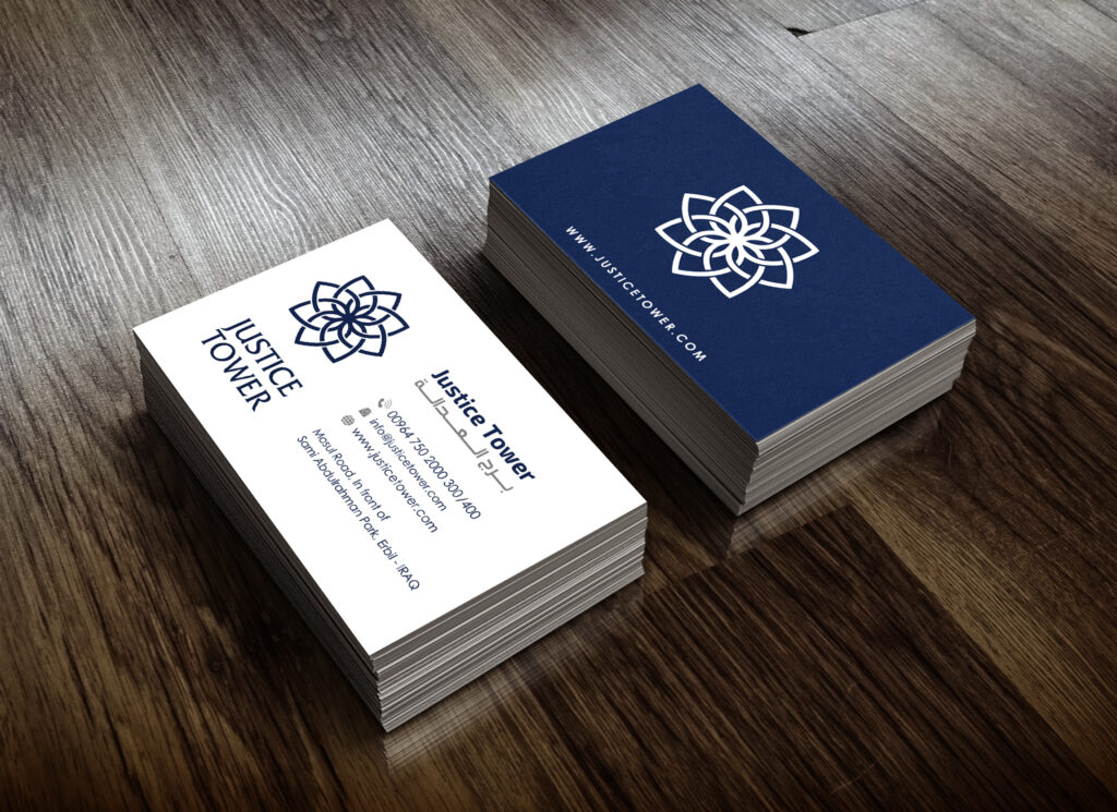
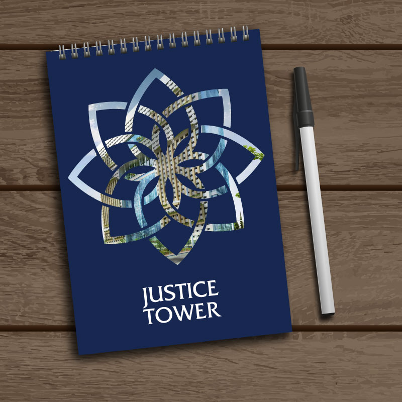
Nasri Group of Companies (NGC) wanted to develop a complete brand identity for Justice Tower, a commercial business tower designed to host a diverse mix of offices, cafés, and retail stores.
After understanding the tower’s role as a shared commercial destination, we created a full corporate branding system centered around the idea of connection and convergence. The Justice Tower logo was designed to represent multiple points coming together into a unified form symbolizing the tower as a central meeting point where businesses and people assemble.
A strong blue color palette was chosen to reflect professionalism, trust, and corporate credibility, making the identity suitable for a modern business environment. The branding system was developed to scale across stationery, signage, and corporate materials.
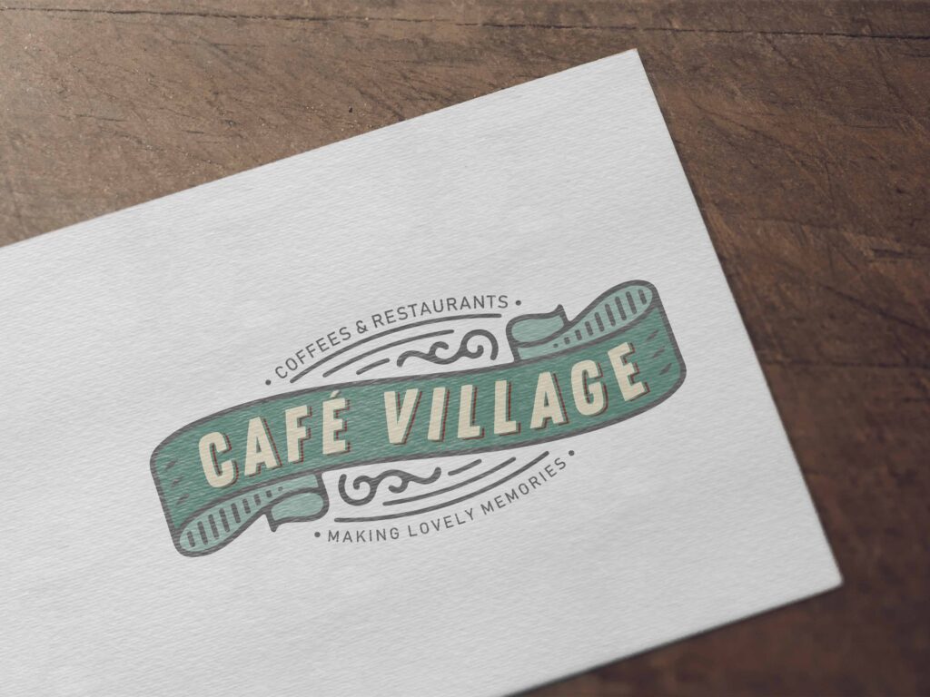
In parallel, we designed branding for in-house retail concepts within Justice Tower, each with its own personality while remaining aligned with the tower’s visual language:
Café Village
An authentic, vintage-style coffee shop. The identity was designed using classic typography and a soft pastel color palette to reflect warmth, craftsmanship, and a timeless café atmosphere.Tic Tac Market
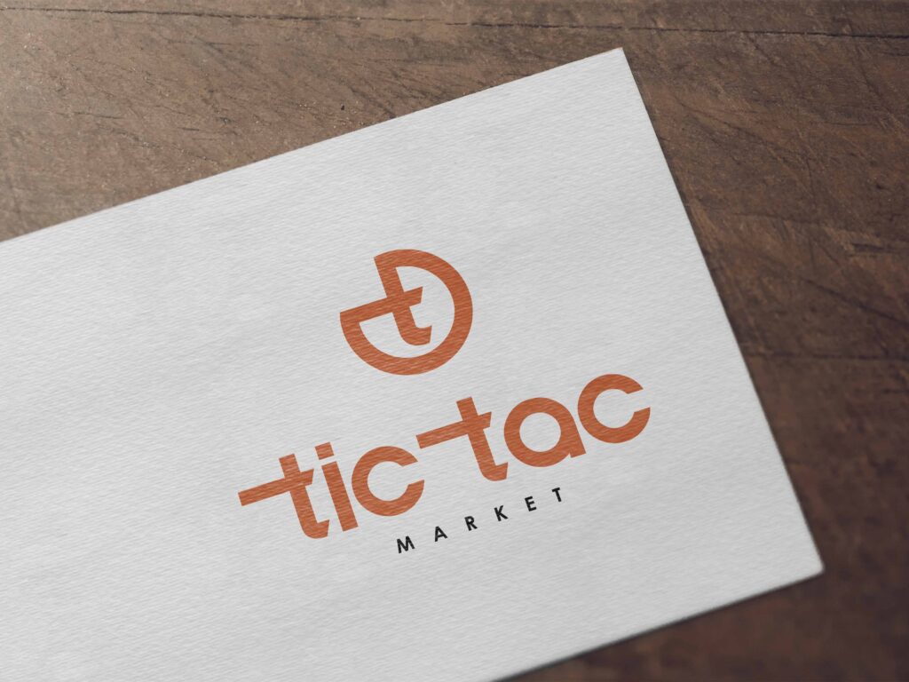
A convenience grocery concept designed for quick visits. The logo is built around the letter “T”, shaped like a watch to symbolize time and short breaks. The orange color palette communicates speed, energy, and efficiency, positioning Tic Tac as a fast and practical stop.
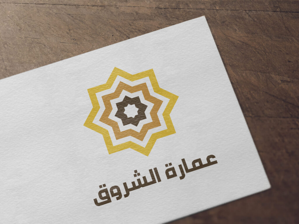
Amarat Chourouk is a standalone real estate project developed under Nasri Group of Companies. The name Chourouk means sunrise in Arabic, referring to the moment when light begins to spread at the start of the day.
The logo was designed as a stylized sun using arabesque geometry, symbolizing emergence, growth, and new beginnings. The color palette transitions from brown to yellow, reflecting the gradual movement from darkness to light as the sun rises visually reinforcing the meaning of the name.
The resulting identity captures the essence of Chourouk through form, symbolism, and color, creating a meaningful and culturally rooted brand presence.