Chamsine Turkey
Logo Rebranding,
Wholesale Brand Identity
& Communication
Chamsine Bakery approached us to refresh their brand identity while preserving the recognition they had built over the years. The goal was not to replace the original logo, but to modernize it updating the design language while staying true to the brand’s heritage and familiar visual cues.
Alongside the main brand, we developed a new logo for Amarin, Chamsine’s wholesale brand serving the Arab diaspora in Turkey. The Amarin identity was carefully designed to feel connected to Chamsine while standing on its own. The concept was inspired by the meaning behind the name Amarin (two moons), as well as visual elements found in the Turkish flag, creating a subtle cultural connection while maintaining brand continuity.
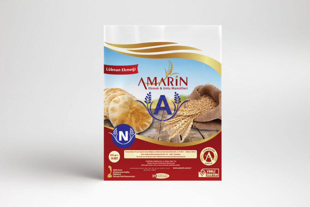
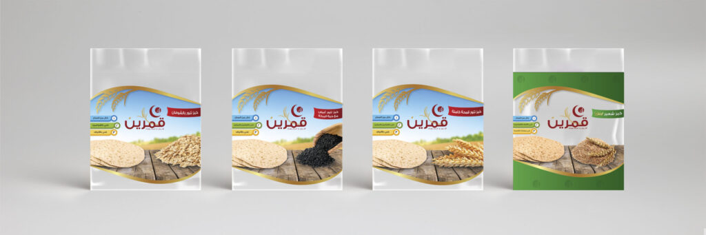
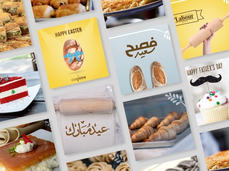
We also designed full wholesale tannour bread packaging, ensuring the bags reflected both quality and authenticity at scale. To support the brand digitally, we developed a social media design concept focused on showcasing Chamsine’s pastries and bread through warm, appetizing visuals that reinforce craftsmanship and product quality.