Caffè Borbone Qatar
In-Store & Retail Visual
Brand Application
Caffè Borbone approached us to strengthen the visual impact of their brand and attract more in-store customers, while fully respecting their existing brand guidelines. The objective was not to redesign the brand, but to enhance how it communicates visually within physical and retail environments, encouraging purchase through stronger product appeal.
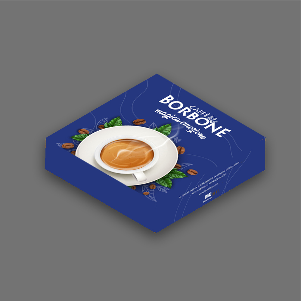
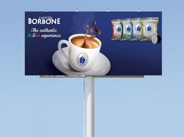
Working within the established blue brand palette, we developed advertising visuals that place the coffee itself at the center of attention. The creative direction focused on showcasing the cup of coffee in a rich, inviting way using warm light-brown tones to create strong contrast against the deep blue background. This approach ensured clear visual hierarchy, strong product visibility, and legibility at distance key elements for effective in-store communication.
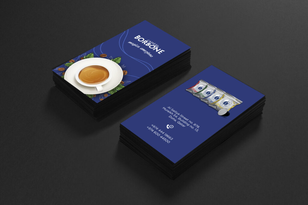
To reinforce freshness and depth, subtle green coffee leaf elements were introduced, adding natural contrast while supporting the brand’s premium feel. Design decisions were guided by visual merchandising principles, ensuring that the visuals remained impactful when applied across physical formats and point-of-sale contexts.
These assets were applied consistently across multiple touchpoints, including billboards, business cards, and coffee packaging. All layouts were prepared with print production accuracy in mind, allowing the visuals to translate seamlessly across printed materials while maintaining brand consistency and a cohesive consumer experience across retail and physical touchpoints.