Chill & Grill Diner
Brand Identity, Menu
& Packaging Design
Chill & Grill approached us with an outdated logo and a fragmented visual presence. The brand lacked a clear identity, had no cohesive packaging system, and relied on poorly formatted menus with typographic errors and generic images sourced online.
Our goal was to rebuild the brand while preserving its familiarity. We maintained the core color palette and redesigned the logo into a cleaner, more confident mark. The framing element was reworked to function both as a flame referencing grilling and a crown, symbolizing leadership and confidence as a standout grill destination.
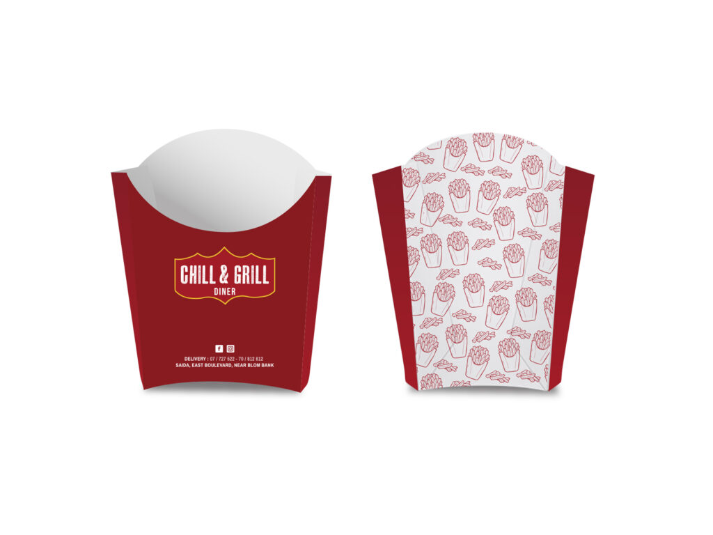
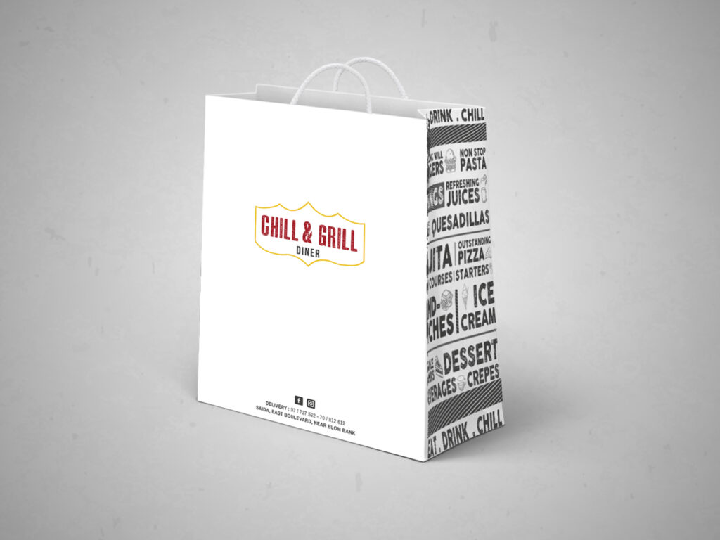
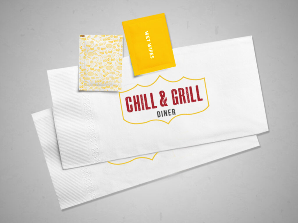
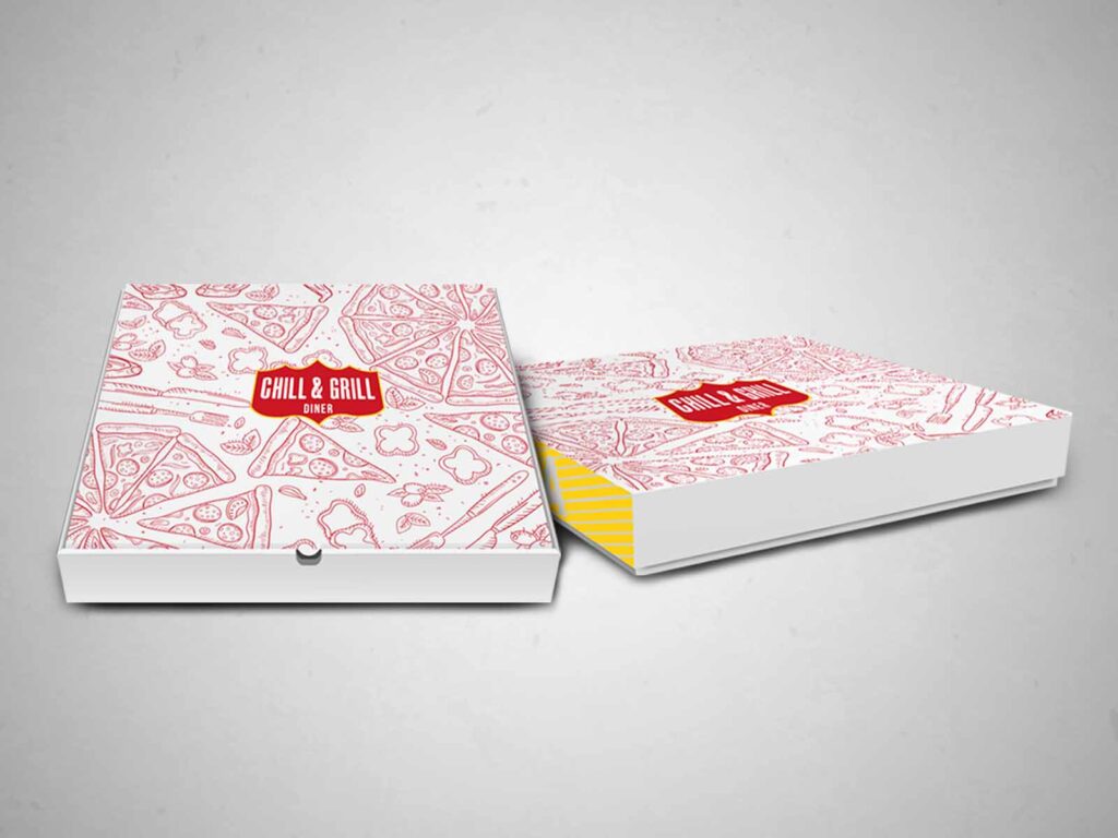
From there, we developed a complete visual identity system applied across all touchpoints. Packaging designs for pizza boxes, fries containers, takeaway bags, napkins, and in-store elements were created using custom patterns and consistent typography, ensuring the brand feels recognizable, bold, and professional at every interaction.
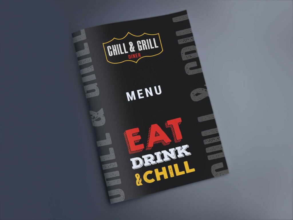
The menu was fully redesigned using newly photoshot food imagery, replacing inconsistent visuals with high-quality, appetizing photography. The structure, typography, and layout were carefully refined to make the menu clear, readable, and easy to navigate improving both the customer experience and ordering flow.
The result is a cohesive, modern diner identity that feels confident, approachable, and built to scale across packaging, in-store use, and takeaway experiences.